
Whenever I have free time to work on game development, I always struggle to concentrate on the game development itself. Sometimes I lose this struggle and I work on something peripheral like logo design. That happened recently, and here's what came out of it:
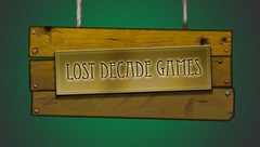 For some reason I kept picturing the name engraved in gold.
And I was thinking it would be cool for the logo to look like a ye olde tavern sign,
like an "INN" sign in classic RPGs.
For some reason I kept picturing the name engraved in gold.
And I was thinking it would be cool for the logo to look like a ye olde tavern sign,
like an "INN" sign in classic RPGs.
I didn't spend much time on this beore I realized I was going in the wrong direction. It looks more like a piece of ugly jewelry glued to a sign hanging by thick string.
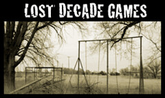 And here's a different approach: an abandoned playground.
I definitely dig the style
(I swear some movie company had an animated logo that had a similar look and it was really cool. Anybody know what that is?)
and I like how it plays on the company name.
But overall it made me more sad than motivated.
Maybe … maybe I am just too sensitive …
And here's a different approach: an abandoned playground.
I definitely dig the style
(I swear some movie company had an animated logo that had a similar look and it was really cool. Anybody know what that is?)
and I like how it plays on the company name.
But overall it made me more sad than motivated.
Maybe … maybe I am just too sensitive …
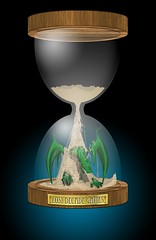 I was actually really pleased with how this concept turned out.
The hourglass represents the idea from the company name about
lost
time,
and the sand falling on the dragon represents the medieval fantasy game we've been wanting to make.
The main problem is: how do you make a logo out of that?
If a logo is rectangular, it's usually horizontal.
We could cut out the top portion but then it looks odd, with the glass stopping at the edge of the image.
I was actually really pleased with how this concept turned out.
The hourglass represents the idea from the company name about
lost
time,
and the sand falling on the dragon represents the medieval fantasy game we've been wanting to make.
The main problem is: how do you make a logo out of that?
If a logo is rectangular, it's usually horizontal.
We could cut out the top portion but then it looks odd, with the glass stopping at the edge of the image.
Plus, the idea of a sundial came up, and that sounded really cool for some reason …
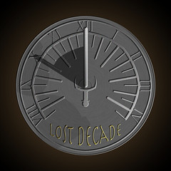 This was my first shot at the sundial concept.
I modeled it after an actual sundial we had in our yard while growing up.
It looks very similar except there was a character where the title is (I think it was the Grim Reaper).
The idea of making the center piece
(the part that casts a shadow to tell the time) a sword came late in the design, which I felt made the whole thing come together.
This was my first shot at the sundial concept.
I modeled it after an actual sundial we had in our yard while growing up.
It looks very similar except there was a character where the title is (I think it was the Grim Reaper).
The idea of making the center piece
(the part that casts a shadow to tell the time) a sword came late in the design, which I felt made the whole thing come together.
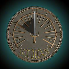 This is a deeper dive into the initial sundial concept.
Copper replaced iron because it strikes me as a very medieval-fantasy type of metal
(probably because it was the first decent
weapon to buy in Dragon Warrior).
Then some texture was added to the face, the hilt of the sword got more design attention,
and the title was enlarged.
This is a deeper dive into the initial sundial concept.
Copper replaced iron because it strikes me as a very medieval-fantasy type of metal
(probably because it was the first decent
weapon to buy in Dragon Warrior).
Then some texture was added to the face, the hilt of the sword got more design attention,
and the title was enlarged.
Overall I think we were pretty happy with it, but we collaborated on an idea to have a stone sundial, where the center piece is actually an axe that was just slammed into the sundial whoooaaaaaa! We thought this was awesomely metal so …
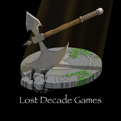 Here it is!
We're really happy with it and we hope it conveys "young company that makes medieval fantasy games for you to enjoy,"
because that was our goal.
Here it is!
We're really happy with it and we hope it conveys "young company that makes medieval fantasy games for you to enjoy,"
because that was our goal.
The "Lost Decade Games" text itself hasn't seen much design attention yet; I think that's something that we'll iterate on. But in the meantime, now we have an image to attach to our various online accounts, which should satisfy our OCD for now.
 Oh boy bonus!
I admit there are some designs we're not showing here because they're embarrassingly bad.
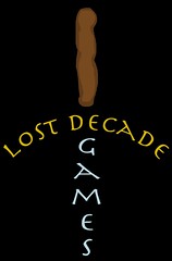
Here's an example: I was exploring the idea of using the name of the company in the design itself,
and I formed the words into the shape of a sword.
Oh boy bonus!
I admit there are some designs we're not showing here because they're embarrassingly bad.
Here's an example: I was exploring the idea of using the name of the company in the design itself,
and I formed the words into the shape of a sword.
It was a decent idea in my head, but in Photoshop it looked so bad I thought it deserved a turd for a handle.
Oh, we also recently added a developer page on Mod DB (and Indie DB, though I don't understand the difference) which had ridiculous logo requirements like image resolutions at: 940x360, 950x150 and 1024x768. Isn't that odd? Anyway you can see more (huge!) versions of the final logo there.
Have you worked on a logo before? What problems did you have and what worked well? Or better yet, have you blogged about it like the Wolfire guys?
LDG © 2022 • Blog • Terms of Service • Video Policy • v2.1.2